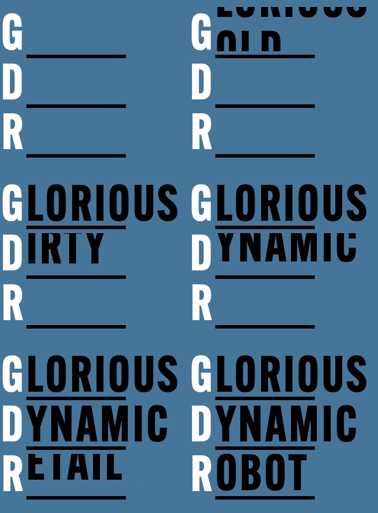
French TV channel Canal+, in collaboration with dyslexia organisation Puissance Dys, has developed ‘Dystitles’ to improve subtitle accessibility for people with dyslexia.
Affecting 8-12% of people, dyslexia is a neurological condition affecting language processing that can pose challenges when reading subtitles, especially due to their format and rapid display on the screen. This can make it more difficult for individuals with dyslexia to access foreign language films and series in their original versions.
Dystitles addresses this issue by introducing an adapted font that enables viewers with dyslexia to read subtitles more easily, eliminating the need to decipher letters individually. The font features black letters with the space inside (the counterform) filled in with white. Using this typography, dyslexic individuals can comprehend subtitles in a manner that aligns with their brain’s perception of letters, as explained by Beatrice Sauvageot, a speech therapist and neuropsychologist who is president of Puissance Dys.
Canal+ emphasises that Dystitles is not exclusively designed for dyslexic individuals, highlighting that non-dyslexic viewers can also understand the subtitles after a brief period of adjustment. The universal applicability of Dystitles ensures a broader reach and inclusivity for subtitle viewership across the board.


